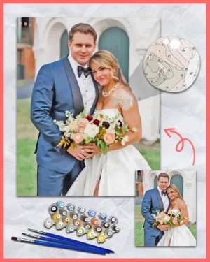
Most frustrations people have with custom paint by numbers don’t come from the painting itself. They usually start with the photo chosen at the very beginning. Our team adjusts images carefully, balancing colors, cleaning details, and preparing them so they work better as paintings. But even with those improvements, the original photo still sets the limits. A canvas can be printed perfectly, the paints can be accurate, and the process can be followed carefully, yet the result can still feel off if the starting image wasn’t well suited for painting. That’s why choosing the right photo matters more than most people expect.
Not every good photo makes a good painting
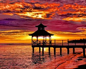
This is usually the hardest thing to accept. A photo can look great on a phone screen and still perform poorly as a paint by numbers canvas. Photography and painting don’t translate the same way. Cameras capture tiny details and subtle gradients that paint simply can’t reproduce without becoming overwhelming.
Paint by numbers works by simplifying. If a photo relies heavily on fine texture, busy detail, or small visual cues, that information gets lost during conversion. A strong photo for painting is usually simpler than people think.
The subject needs to be obvious, not implied
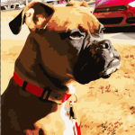
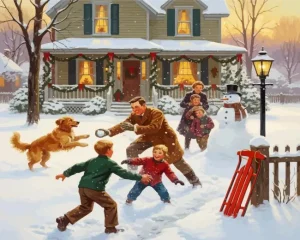
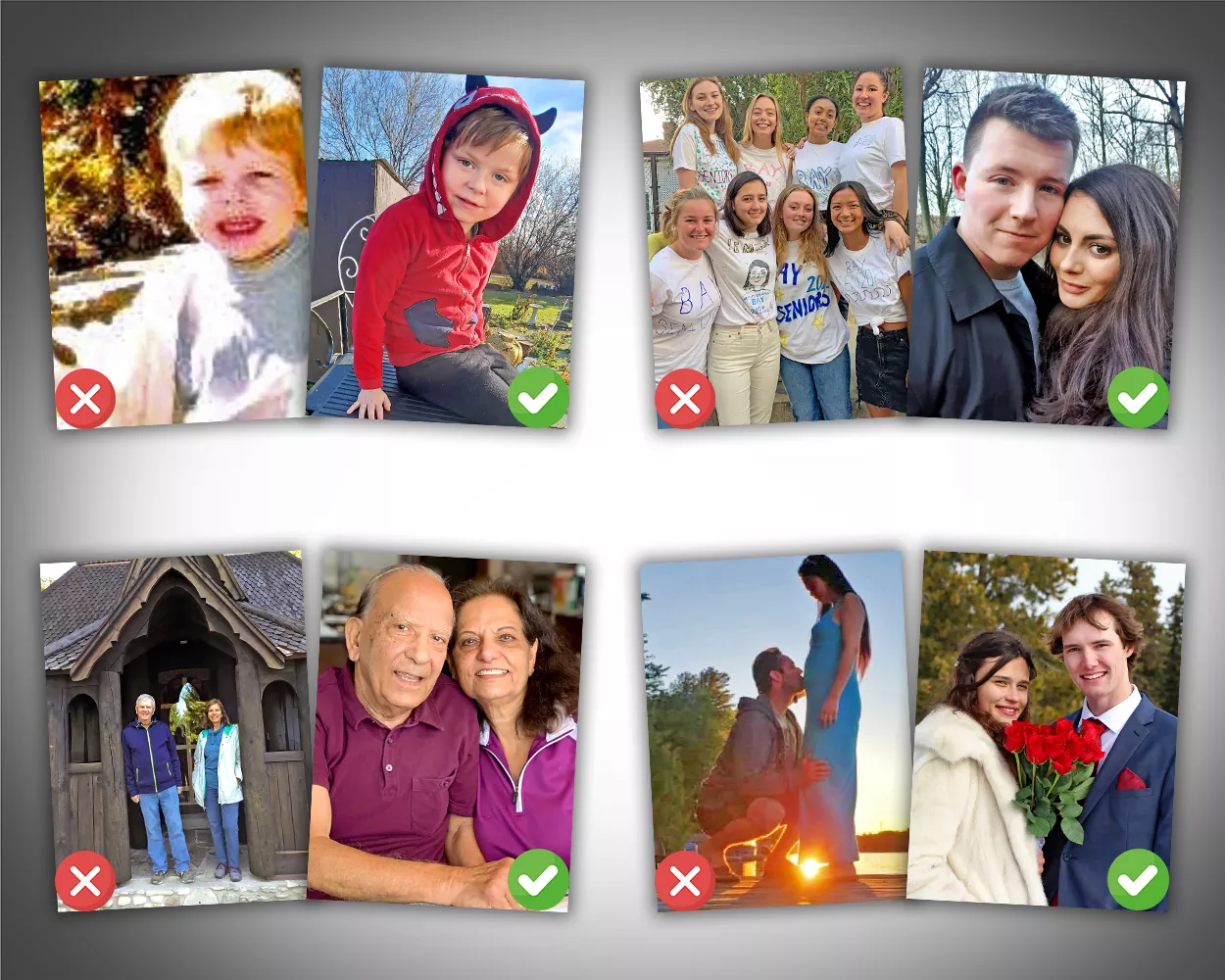
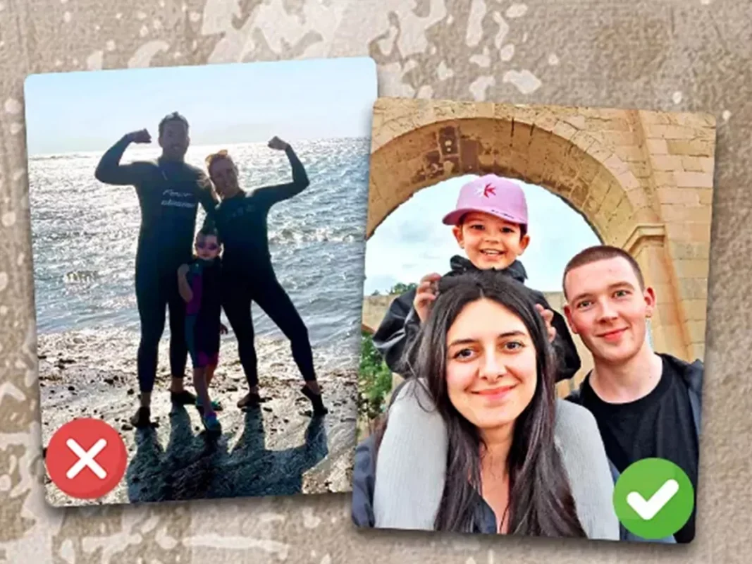
When someone looks at your photo, they should immediately understand what the subject is. That doesn’t mean centered or staged, it means clear. If you have to explain what the photo is showing, the painting will struggle. This is why choosing the right photo matters so much early on. Paint by numbers breaks images into sections, and subtle elements disappear first. A face half-hidden in shadow, a pet blending into the background, or a distant figure in a landscape often loses its impact once simplified.
Photos where the subject stands out clearly tend to paint better and feel more rewarding to work on.
Lighting problems don’t fix themselves later
Poor lighting is one of the most common issues.
Dark photos flatten quickly. Strong flash creates harsh shadows that turn into awkward blocks of color. Overexposed areas lose detail entirely. Painting by numbers depends on visible contrast. If the camera already struggled to capture detail, the conversion process has nothing to work with. Natural light is usually best. Even lighting matters more than dramatic lighting. What looks moody in a photo often looks confusing in a painting.
Sharpness matters more than resolution
People often worry about image size, but sharpness is the real issue. A slightly smaller photo that’s clear and focused almost always performs better than a large image that’s soft or blurry. Edges matter. Facial features matter. Transitions between shapes matter. If you zoom into your photo and important areas already look fuzzy, those areas will become guesswork on the canvas. Paint can’t restore detail that isn’t there.
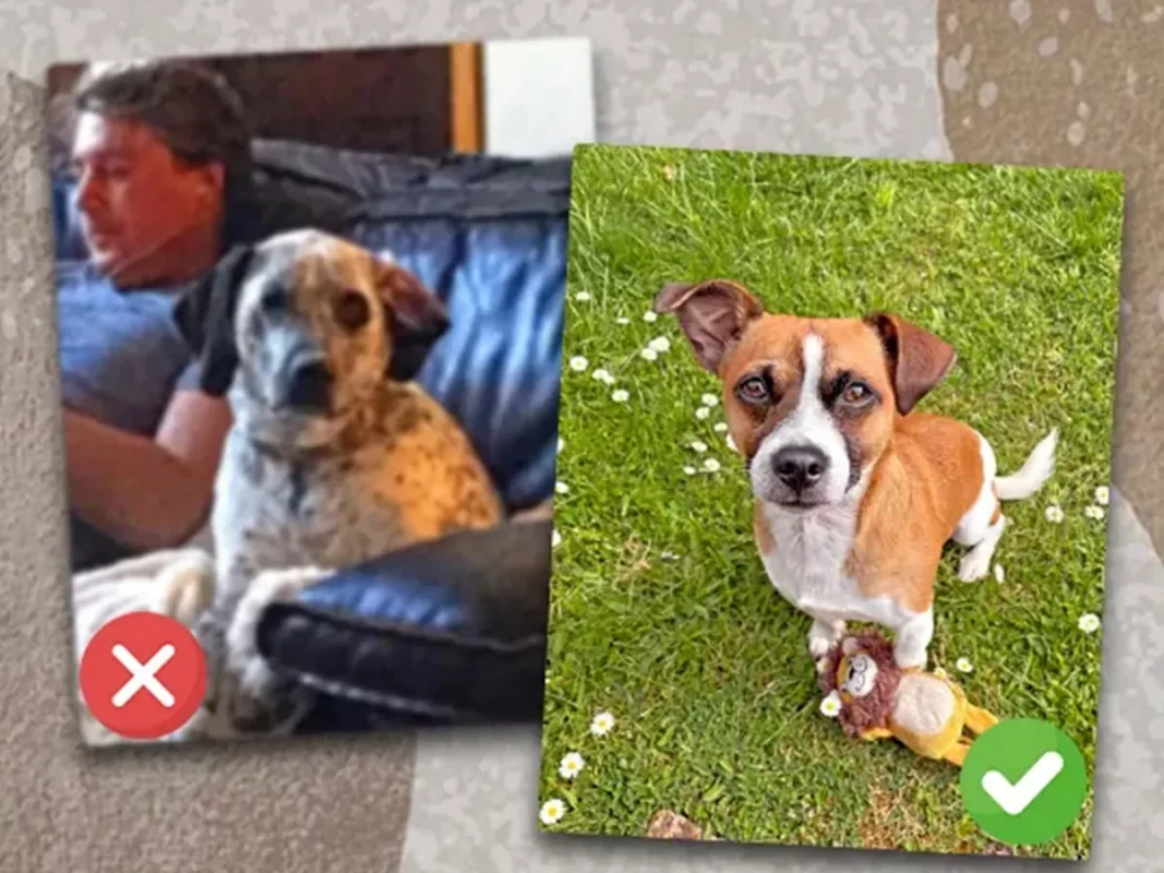
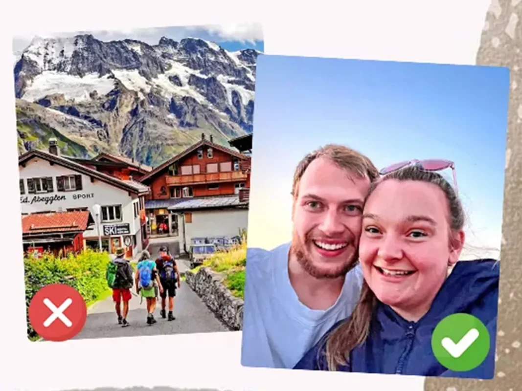
Backgrounds can quietly ruin the experience
Busy backgrounds create work without adding value, which is something to keep in mind when choosing the right photo.
Busy backgrounds tend to create a lot of work without adding much in return. Things like trees, crowds, or heavily textured walls get broken into countless small sections that take time to fill but don’t really improve the final result. Backgrounds don’t need to be empty — they just need to stay out of the way. When the subject stands clearly on its own, the painting is usually much more enjoyable to work on.
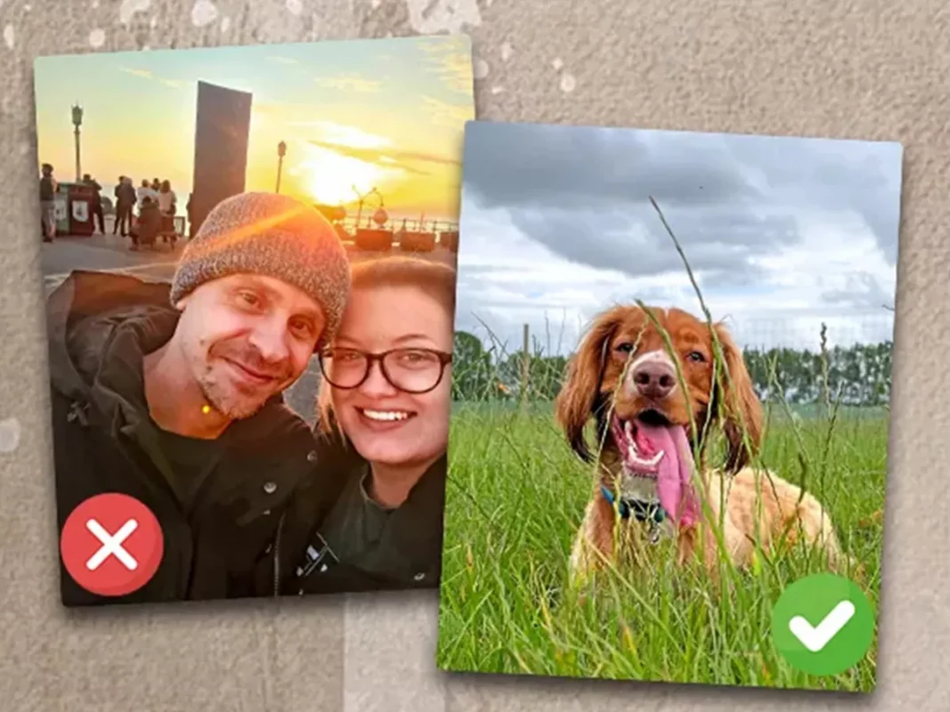
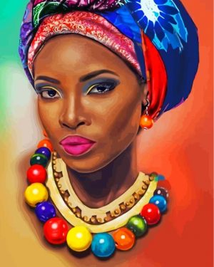
Faces and small details need room to breathe
Faces are unforgiving.
If a face takes up only a small portion of the photo, expression and character often disappear once simplified. Eyes become flat. Mouths lose shape. The result can feel lifeless even if the painting is technically correct. Closer photos almost always work better than distant ones. Giving the subject more space allows details to survive the conversion process.
Understanding what paint by numbers is (and isn’t)
This part matters. Paint by numbers doesn’t recreate photos exactly. Colors are reduced. Gradients become blocks. Fine detail is intentionally simplified so the painting stays manageable. Understanding this upfront, and selecting the right image with that in mind, makes a big difference. The goal isn’t a photographic copy, but a painting that feels balanced and achievable. People who know what to expect tend to enjoy the process far more than those expecting perfect realism.
A simple reality check before uploading
Before choosing a photo, it helps to pause and ask a few honest questions:
- Is the subject immediately clear?
- Can I see important details without zooming?
- Is the lighting even enough to show shape and contrast?
- Does the background add value or distraction?
If the photo passes those questions, it usually paints well.
Final thought
Choosing the right photo doesn’t guarantee a perfect painting, but it removes most of the avoidable problems. A good image makes the process smoother, the result clearer, and the experience far more satisfying. The brushwork matters, but the photo decides the direction long before the first color is applied.