Colors are everywhere, yet most people never stop to question why certain combinations feel balanced while others seem off. That reaction is not accidental. It comes from a structured system that explains how colors relate, contrast, and influence perception. Understanding Color Theory Basics gives clarity to choices that often feel instinctive but unexplained.
Once these principles are understood, color stops being guesswork. Instead, it becomes a practical tool that supports creativity, decision-making, and visual confidence.
Why Color Theory Is More Useful Than Most People Expect
Although its use extends well beyond these particular professions, color theory is often linked to artists and designers. In daily life, colors have an impact on comfort, mood, and focus. For example, a room may feel warmer or cozier just by choosing certain colors. Similarly, depending on how colors interact, clothing combinations might appear purposeful or mismatched.
As a result, mastering the fundamentals gives one a sensation of control. People are able to make well-informed judgments that seem emotionally and visually suitable instead of depending on trial and error.
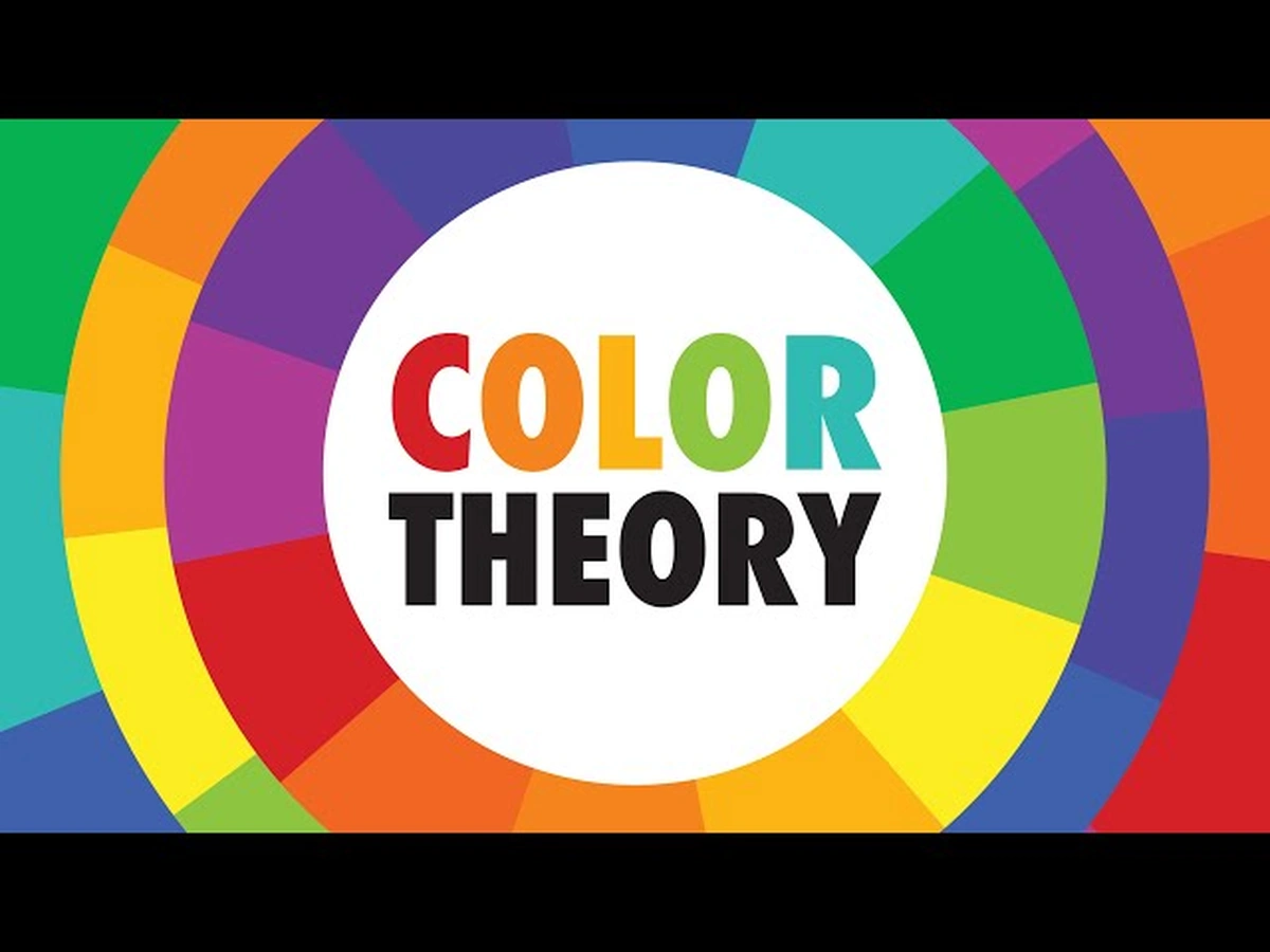
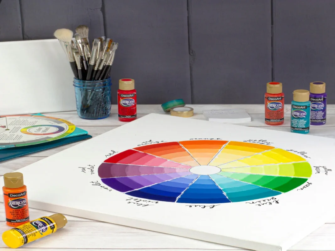
The Color Wheel Explained as a Visual Guide
The color wheel is the central component of color theory. It serves a practical purpose rather than being aesthetically pleasing. The wheel arranges colors in a way that highlights their similarities and differences.
Everything begins with three primary colors: red, blue, and yellow. You cannot create these colors by mixing others. Instead, they act as the foundation for the entire system.
When two primary colors are combined, secondary colors appear. From there, further variations develop. This structure helps explain why colors feel related and why some transitions appear smoother than others.
How Color Mixing Builds Understanding
Mixing colors does more than create variety. It reveals relationships. Once people see how one color leads to another, the system becomes logical rather than abstract.
For example, colors that are near together on the wheel have the same characteristics. They thus have a tendency to blend in. On the other hand, stronger visual tension is produced by placing colors farther apart. Color choosing feels deliberate rather than haphazard when these patterns are recognized.

How Color Temperature Shapes Mood and Balance
Another essential concept within Color Theory Basics is color temperature. This idea explains why colors trigger different emotional responses.
Colors of warmth like orange, yellow, and red have a tendency to be conspicuous and energizing. Cool colors like blue and green can evoke a feeling of tranquility or detachment. Gray and beige soften stronger tones while giving the eye a natural place to pause.
Blending these groupings carefully makes visual harmony easier to achieve.

Small Adjustments That Change Everything
Color does not remain fixed. Subtle changes can dramatically alter how a shade feels.
When you add white, the color becomes lighter and takes on a softer, more open feel. Black gives the color more depth, weight, and intensity. Conversely, gray tones down a hue, which makes it less apparent and harmonious.
Thanks to this flexibility, one color easily takes on different roles with small adjustments.
Understanding the Contrast Behind Effective Color Pairings
Additionally, the color wheel clarifies that some combinations are naturally pleasing. While colors that are opposite one another provide contrast, colors that are next to one another typically seem harmonious.
For example, blue and green transition smoothly, while blue and orange draw attention when paired. Understanding this structure makes it easier to experiment without losing balance.
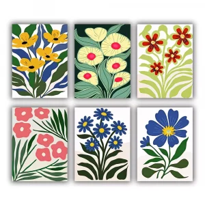
Color Theory Basics Through Hands-On Practice
Theory becomes clearer when it is experienced visually. Paint by numbers offers a practical way to see color relationships unfold step by step.
Each part guides the color choices, so tones, contrasts, and patterns come together naturally. This approach gradually develops an instinctive knowledge of how colors complement each other on a single surface. At the same time, the completed artwork frequently turns into something valuable to showcase or give as a present.

The Emotional Influence Behind Color Choices
Color does more than decorate. It communicates. Red can signal urgency or passion, while blue often suggests stability or trust. These associations explain why color choices matter in branding, interiors, and visual storytelling.
Even when no one is thinking about it, color still shapes the mood of a space and the message it sends.
Bringing Color Theory Basics Into Everyday Decisions
You may gain color knowledge without having any artistic expertise. Understanding the fundamentals makes it simple to apply them to every day activities. Color theory makes choices feel intentional rather than coincidental when organizing a living area, producing digital content, or choosing clothes.
When you understand color theory basics and read the color wheel correctly, colors become clear and manageable. Instead, they come together to form a coherent system that supports balance, emotion, and visual clarity in both real-world and creative situations.